Component library
Based on shadcn/ui, with Scoutie Sans and DAL teal. Default component sizes, spacing, borders, shadows and states.
Buttons
Inputs
Selection
Badges and alerts
DefaultSecondaryOutlineDestructive
A note for your team
This is the default alert component.
Something went wrong
Check your details and try again.
Tabs
Card
Create a project
A standard shadcn card with its default padding and typography.
Dialog
Default overlay, content, close button and transitions.
Accordion
Only Scoutie Sans and the primary teal colour. These are the generated shadcn components.
Slider and progress
Completion
Avatars
AMJLSK
AM
Alex Morgan
alex@example.com
Toggles
Table
| Invoice | Status | Amount |
|---|---|---|
| INV-001 | Paid | €250.00 |
| INV-002 | Pending | €150.00 |
| INV-003 | Paid | €350.00 |
Skeleton
Tooltips
Hover or focus a button to see its tooltip.
Breadcrumb
Pagination
Radio group
Selected: weekly
Collapsible
Project details
Scroll area
Aspect ratio
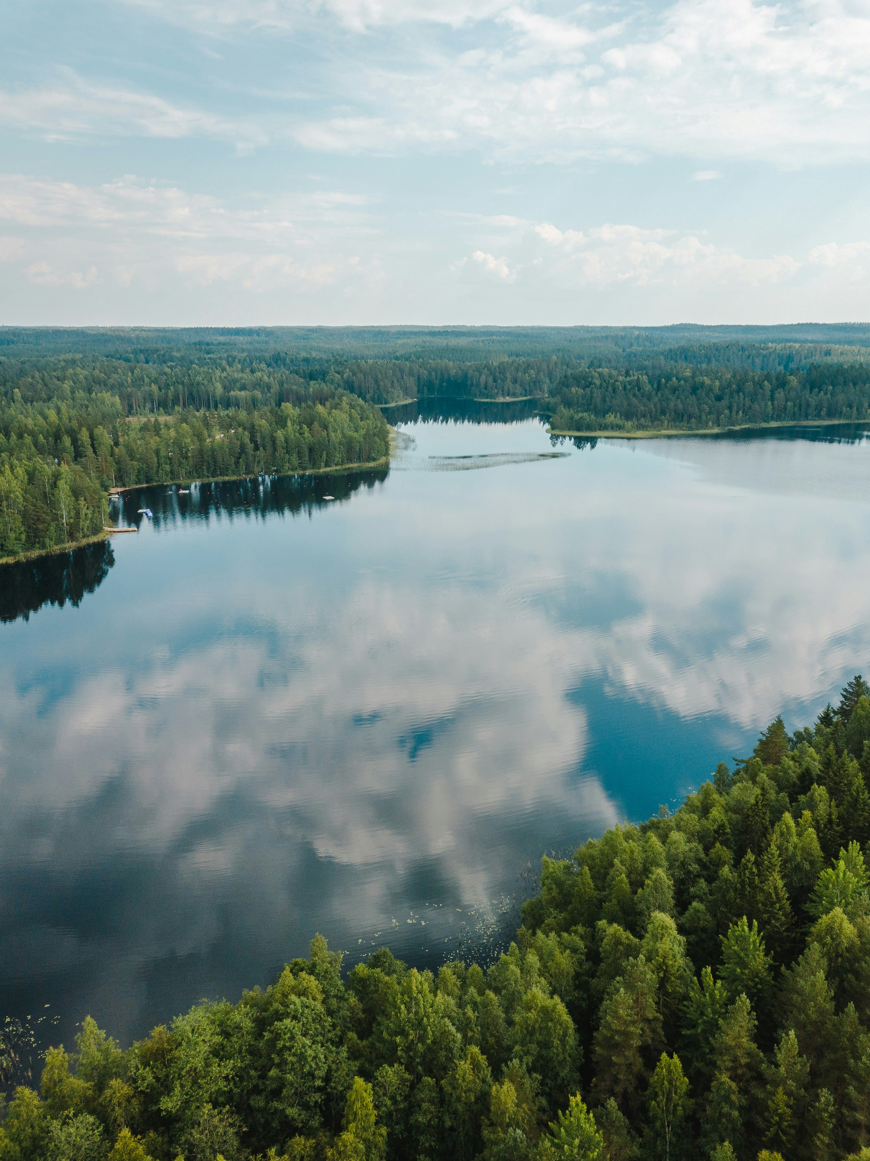
A 16:9 image that scales with its container.
Keyboard keys
Search⌘K
Save⌘S
CloseEsc
Keycap examples only; these shortcuts are not registered.
Spinner
Loading content
Examples of an ongoing operation.
Date picker
Calendar and popover composed into a date picker.
Searchable combobox
Search, select or clear a reviewer.
Dropdown actions
No action selected.
Activity is visible.
Settings sheet
Workspace: Design library
Notifications: On
Confirmation dialog
Example project: Active
Typography
Scoutie Sans
Regular text · 400
Interface text · 500
Emphasised text · 600
Component typography follows the preset.